quantified attention

research question

What does a week of phone data actually describe, and what does it leave out? This project looks at how quantifying everyday phone use shapes how a week of my life is understood. Rather than treating screen time as a problem to solve or optimize, I am interested in how counting attention turns ordinary habits into something that feels measurable and meaningful!

dataset and collection

This dataset focuses on one week of phone use in early November, beginning on November 4. Each row represents one day, resulting in seven consecutive days of data. The data was not recorded live each day; instead, I went back at the end of the week and reconstructed daily activity using Apple’s Screen Time dashboard, which stores detailed data by date.

For each day, I recorded total screen time in minutes, phone pickups, notifications, the most used app, and time spent on that app. When available, I also logged social media time. These values came directly from Screen Time and reflect how Apple categorizes and summarizes phone activity.

Alongside these digital metrics, I added context information manually in the tool tip, including work hours, class time, and commute time. These variables were meant to be rough markers of how each day was structured. Including them allowed the dataset to reflect lived experience rather than just isolating my phone use from the rest of daily life.

visualization

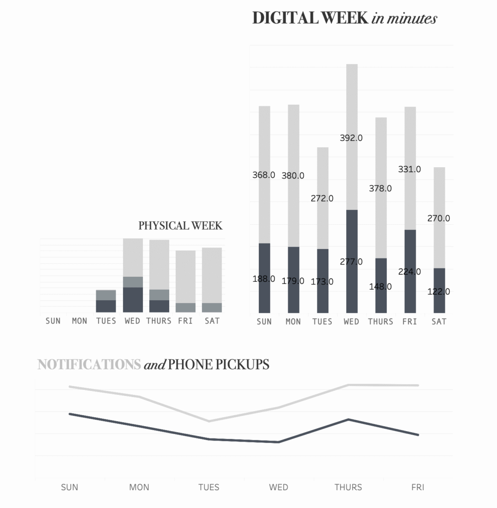
The visualization presents the same week of data across three views. The largest chart shows total daily screen time in minutes using stacked bars. Each bar represents one day, with segments indicating different types of phone use. Wednesday stands out as the heaviest day, while Tuesday and Saturday are noticeably lower. Rather than forming a clear pattern, the week appears uneven and inconsistent.

A smaller chart shows physical or non digital activity during the same week. Compared to the digital bars, these values appear compressed and sparse. Several days show little visible activity, and most of the movement is clustered midweek. Placing these charts side by side emphasizes how much more visual weight the digital data carries, even though they both do describe the same span of time. The line chart tracks notifications and phone pickups. These values fluctuate less dramatically than total screen time. Even on days with lower overall use, the habit of checking the phone remains steady. The smoothness of the lines makes this behavior feel routine and automatic rather than deliberate.

interpretation and conclusion

When you look at these charts altogether, the week reads as super dense, repetitive, and not very balanced. The visualization does not suggest improvement or decline. Instead, it frames phone use as a constant background presence that quietly structures attention across the day. The inclusion of work, class, and commute time complicates simple assumptions about screen time as distraction, while still showing how deeply phones are embedded in everyday routines. I consider this to be a ‘roadmap’ of my day. A great lesson to be learned from this project? Put down the phone.

This project is limited by its short timeframe and by the logic of Apple’s tracking system, which defines what counts and what does not. Reconstructing the data retrospectively also introduces uncertainty, especially in the contextual variables. Rather than correcting these issues, the project treats them as part of the story.

reframing the same body

research question

This project asks a simple question: how can the same personal health data tell very different stories depending on how it is visualized? Using biometric data from my Ultrahuman ring, I explore how design choices like ordering, scale, and treatment of missing data can frame the body as improving, declining, disciplined, or stagnant. Instead of treating wearable data as neutral or factual, this project looks at how meaning is built through visual presentation.

dataset and context

The dataset comes from my personal Ultrahuman ring and includes daily biometric and activity data collected between January and November 2025. Each row represents one day, and the main variables used in this project are recovery score, sleep score, and step count. The data was automatically collected by the device and exported as a CSV file through the Ultrahuman app. Like most personal wearable data, the dataset is incomplete. There are days with missing values, periods of low activity, and stretches where the numbers barely change. Rather than cleaning these issues away, I chose to work with them directly and use them as part of the visual story.

framing a: decline, gaps, and flatness

In the first set of visualizations, the data is presented chronologically from January to November. The recovery score appears as a red line that peaks early in the year and then drops sharply, with a long low point during the summer months. Missing data is explicitly labeled, creating a visible gap that breaks the line and draws attention to absence rather than continuity.

The step count chart on the right reinforces a similar feeling. The values fluctuate, but the overall movement trends downward, ending on a low point that is labeled. The sleep score bars below feel uneven and subdued, with missing data again called out rather than hidden.

Together, these charts frame the data as a story of decline or inconsistency. The emphasis is on what is missing, what drops off, and what fails to recover. Even though the data itself has variation, the visual choices make the year feel unproductive, interrupted, and flat.


framing b: growth + progress

The second set of visualizations uses the exact same data, but reordered and reframed. Instead of showing time chronologically, the values are rearranged to create an upward progression. The recovery score now appears as a green line that steadily climbs, ending on its highest point. The step count chart mirrors this movement, rising sharply and finishing with a large, clearly labeled value.

The sleep score bars are also reordered so that shorter bars appear first and taller bars appear last. This creates a visual rhythm of improvement, even though no new data has been added. Missing values are treated more quietly here, no longer breaking the flow of the charts.

This framing suggests discipline, momentum, and progress. The body appears to be improving over time, becoming more active and more rested. The same dataset that previously felt stagnant now reads as successful and motivating.

what changed 

What’s important is that nothing about the underlying data changed between these two framings. The recovery scores, step counts, and sleep scores are identical. What changed was the visual logic: ordering instead of time, emphasis instead of neutrality, and whether absence was highlighted or minimized.

These choices are subtle, but their impact is strong. One version invites concern or disappointment, while the other invites pride or optimism. Both feel believable. Both feel truthful. And neither required manipulating the data itself.

why this matters

Wearable devices are often marketed as tools for self-improvement, but they rely heavily on visualization to tell that story. Charts, scores, and trends don’t just reflect the body; they shape how the body is understood. This project shows how easily personal data can be framed to support different narratives, even when the numbers stay the same. By placing these visualizations side by side, I want viewers to question what they are being shown and why. Data does not speak for itself. It is always arranged, filtered, and framed. Recognizing that process is an important step toward being a more critical reader of both personal and public data.

conclusion

This project treats data visualization not as a tool for finding a single truth, but as a way of constructing meaning. Future versions of this work could expand to include longer time spans, different wearable metrics, or comparisons between multiple people. For now, the goal is simple: to make visible how much power lives in visual choices, especially when the data is about our own bodies.

311 Data – Tracking Health Issues 2019-2024

Data Visualization of 311 Data
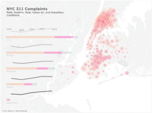
My research question for this project is: Which NYC neighborhoods reported the most complaints about mold, pests, and heating outages between 2019 and 2024, and what does that reveal about housing quality and health risks? I chose this question because issues like mold, pests, and lack of heat go beyond simple maintenance problems. They can seriously affect people’s health, especially in communities already facing poverty or aging housing. By looking at these complaints, I wanted to see where these problems are most common and what that might say about inequality across New York City. My audience includes city residents, housing advocates, and local organizations who want to understand where housing problems are concentrated and why they matter.

The data for this project comes from the NYC 311 Service Requests dataset on the NYC Open Data portal. It’s maintained by the New York City Office of Technology and Innovation and includes millions of service requests from 2010 to the present. Each record represents a complaint submitted by a resident through phone, app, or online form. The dataset includes information about what the complaint was, where it happened, and what action was taken. This makes it a useful source for understanding where people experience housing issues.

For my analysis, I focused on a few key variables. “Complaint Type” shows what kind of problem was reported, such as mold, pests, or heating and hot water issues. “Borough” and “Incident ZIP” show where the problem occurred. “Created Date” shows when the complaint was made, which helped me find patterns over time. “Status” shows whether the complaint was open or closed. I filtered the data to only include complaints about mold, pests, and heating from 2019 to 2024, which let me focus on recent trends and changes after the pandemic.

There are some limits to this data. Since 311 relies on people to report problems, not every issue gets recorded. Some residents may not know about 311, might not trust the system, or might worry about landlord retaliation. That means some neighborhoods could look like they have fewer problems even if the conditions aren’t better. Also, people might describe similar problems differently, so some complaints might not fall under the same category. Even with these limits, the data still helps show where housing problems are being reported most often.

My final visualizations are on Tableau Public and can be viewed here:
https://public.tableau.com/app/profile/della.wirfel/viz/Wirfel_Della_Project1_DataVis/MainDashboard

The dashboard includes an interactive map showing where complaints are most common, a line chart that shows changes over time, and a bar chart comparing boroughs. The map uses color shading to show complaint density, the line chart shows seasonal patterns like spikes in heating complaints during the winter, and the bar chart highlights which boroughs have the most reports overall.

From 2019 to 2024, the Bronx and Brooklyn had the highest number of complaints about mold, pests, and heating. Heating complaints rise sharply during the colder months, while mold and pest complaints increase in the summer. Neighborhoods in the South Bronx and central Brooklyn had the highest concentrations of complaints, which often line up with areas that have older housing and lower income levels. Wealthier areas, like parts of Manhattan and Staten Island, had fewer complaints, which could reflect better housing conditions or differences in how often people report issues.

Overall, the data shows that housing quality and health risks are uneven across the city. The neighborhoods with the most complaints are also the ones that tend to have the fewest resources and the oldest buildings. This suggests that the city should target more housing inspections and tenant protections in these areas. Future projects could connect 311 data with public health information or building inspection records to better understand how poor housing affects residents’ health. My goal with this project was to make the issue more visible and encourage action toward safer, healthier housing for all New Yorkers.